The Power of Color: How to Use Color Theory!
Color is a vital element of design and sketching. It can convey meaning, evoke emotions, and create visual impact. Understanding color theory can help you use color effectively in your design and sketching projects. Stay till the end because we will explore the basics of color theory and how it can be applied in your work!
Understanding Color Theory
The Color Wheel
The color wheel is a visual representation of the relationships between primary, secondary, and tertiary colors. Primary colors, such as red, yellow, and blue, cannot be created by mixing other colors. Secondary colors, such as orange, green, and purple, are created by mixing two primary colors. Tertiary colors, such as red-orange, yellow-green, and blue-violet, are created by mixing a primary color with a secondary color.
Color Harmony
Color harmony is the pleasing combination of colors. There are four types of color harmony:
- Complementary: Colors that are opposite each other on the color wheel, such as red and green, create a high-contrast and dynamic look.
- Analogous: Colors that are next to each other on the color wheel, such as blue and green, create a cohesive and peaceful look.
- Triadic: Three colors that are evenly spaced on the color wheel, such as red, yellow, and blue, create a balanced and vibrant look.
- Monochromatic: Different shades and tints of the same color, such as light blue, medium blue, and dark blue, create a subtle and elegant look.
Color Relationships
Color relationships refer to the way colors interact with each other. There are three types of color relationships:
- Warm colors: Colors that evoke a sense of warmth and energy, such as red, orange, and yellow.
- Cool colors: Colors that evoke a sense of calmness and tranquility, such as blue, green, and purple.
- Neutral colors: Colors that do not belong to warm or cool colors, such as black, white, and gray.
Using Color Theory in Design Projects
Color Psychology
Color psychology is the study of how colors affect human emotions and behaviors. Different colors evoke different emotions and perceptions. For example:
- Red: Passion, energy, and excitement
- Blue: Calmness, trust, and intelligence
- Yellow: Happiness, optimism, and creativity
- Green: Nature, growth, and health
- Purple: Royalty, luxury, and spirituality
- Orange: Enthusiasm, warmth, and playfulness
- Pink: Femininity, romance, and sweetness
- Brown: Stability, reliability, and earthiness
Understanding color psychology can help you choose colors that align with the message and purpose of your design project.
Choosing Color Palettes
Choosing a color palette is an essential step in any design project. Here are some tips on how to choose a color palette:
- Start with a base color: Choose a primary color that represents the message and purpose of your project.
- Create color harmony: Use complementary, analogous, triadic, or monochromatic color schemes to create a pleasing and balanced combination of colors.
- Consider color psychology: Choose colors that evoke the desired emotions and perceptions.
- Use contrast: Use contrast to create visual interest and hierarchy in your design project.
Examples of Color Usage in Design
Color can be used in various design projects, such as logo design, website design, and print design. Here are some examples:
- Logo design: A logo represents a company’s brand identity. Choosing the right colors for a logo is crucial to convey the right message and create a lasting impression. For example, the McDonald’s logo uses the colors red and yellow, which are associated with energy, excitement, and happiness, to represent the fast-food chain.
- Website design: Color can be used to create a mood and atmosphere on a website. For example, a website for a yoga studio might use cool colors such as blue and green to convey a sense of calmness and relaxation. On the other hand, a website for a nightclub might use warm colors such as red and orange to convey a sense of energy and excitement.
- Print design: Color can be used to make printed materials stand out and grab attention. For example, a poster for a music festival might use bright and vibrant colors to create a sense of excitement and enthusiasm.
Using Color Theory in Sketching Projects
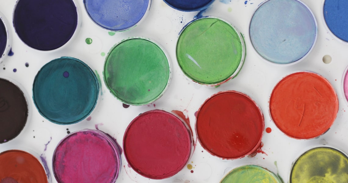
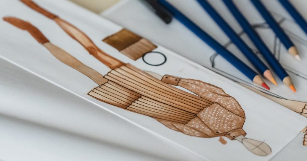
Color Mediums
There are various color mediums that can be used in sketching, such as colored pencils, markers, and watercolors. Each medium has its unique properties, such as opacity, transparency, and saturation. Understanding the properties of different color mediums can help you choose the right medium for your project and achieve the desired effect.
Color Techniques
Color techniques refer to the different ways color can be applied in a sketching project. Here are some examples:
- Layering: Layering colors on top of each other can create depth and dimension in a sketch.
- Blending: Blending colors together can create a smooth and gradual transition between two colors.
- Cross-hatching: Cross-hatching is a technique where lines are drawn in two or more directions to create a hatched pattern. It can be used to add texture and shading to a sketch.
- Splattering: Splattering paint or ink on a sketch can create a spontaneous and unpredictable effect.
Color Compositions
Color compositions refer to the arrangement of colors in a sketch. Here are some examples:
- Complementary: Using complementary colors in a sketch can create a high-contrast and dynamic look.
- Analogous: Using analogous colors in a sketch can create a harmonious and peaceful look.
- Monochromatic: Using different shades and tints of the same color in a sketch can create a subtle and elegant look.
- Triadic: Using three evenly spaced colors on the color wheel can create a balanced and vibrant look.
Conclusion
Color theory is a powerful tool that can help you use color effectively in your design and sketching projects. By understanding the basics of color theory, you can choose the right colors, create pleasing color combinations, and convey the desired message and emotions in your work.
Experiment with different color palettes, mediums, techniques, and compositions to create unique and impactful designs and sketches. Remember, color is not just about aesthetics; it’s about communication and expression.